FABYAN MEDIA STUDIES A LEVELS
2022/2023
PHOTOSHOOT
The photoshoot was held on 10th April after a 6 week delay due to terrible luck, last-minute family occasions, lockdown and band members getting Covid. By this time, my motivation is hindered but I pushed through. The photoshoot on that day went as expected. I had fun and went home with a few photos for the magazine.
mise-en-scene

Members:
- Joshua on keys [curly hair guy]
- Haris on bass & vocals [blue shirt]
- Bazli on drums [child]
- Me on guitar
behind-the-scenes

This is video proof of me taking the photos. I took this video at the very last minute thus the terrible angle. I tend to forget a lot of things in a loud environment especially when jamming.
This video is taken before Bazli came and during that time, the owner of the studio covered for him on the drums and insisted I join on the guitar.


These are the photos that I came home with that day. Most of the photos came out dark but that can definitely be fixed. If I can't work with the pictures in photoshop, I will surely plan for a reshoot.


These are the only pictures that I can bear to look at. The photo on the left will most likely be used for the double-page spread and the one on the right will be for the cover. I chose these because I like the angles it was taken and that the background isn’t too cluttered. My tutor said he liked the one on the left. Note that these are raw images.
In 21st April, I accompanied my friend Haris [my model] on his photoshoot with the band Astroturf as he is making his own music magazine and I brought my camera so I can take more photos of him as a second photoshoot. But then, I got carried away with jamming with them and I literally took one photo of them during those 2 hours.

The photo above I will use for contents page as the photo is quite simple and will blend in with the simple layout of the contents page.
EDITING
I will be using Photoshop to edit these photos. Luckily, I already have a few months of experience in Photoshop by making posters in my free time. Making a magazine is new to me as it requires lot of planning and calculated decisions which is not done a lot when I’m making posters.
The main flaws of the photos that I want to fix is the brightness and that the colours don’t really match what I have in mind.
magazine cover
1.


For the cover image, I first adjusted the brightness on my phone first because I find it simpler and less tedious to do it here. Then, I sent it to my laptop.
In photoshop, I duplicated the image gave it a gaussian blur effect and set blending mode to lighten to give that diffused glow look. Adjusted the red values using the colour curve thing to get the look that I wanted and set that opacity down to 60% so that it would not look excessive and finally adjusted the brightness and contrast one more time.
This is the result.

2.

I added dummy text to figure out the placements so that I wouldn’t stress on thinking of the actual words to put in it later. The font is arial black but it is liable to change. Added a barcode that I found off google. Added a rectangle and with centre strokes and zero fill as a frame. I grouped them all together but separate from main image so I can toggle it on whenever I need reference. I also added noise and set the opacity to 4% so that the existing digital noise from the raw image will blend in better and look more film-like.
3.
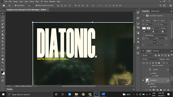
Added the masthead and the font set to Haettenschweiler and I gave it a worn out white colour [fffcec]. Then, gave it very subtle outside stroke of 3 pixels to make it thicker. For the tagline, I can’t decide between the one shown or ‘’there’s more to everything’’ but both of those phrases imply that there are multiple sub-cultures brewing that only a handful of people are in the know. I added the asterisk as a full stop.
4.

For the barcode, I just tweaked an existing barcode I found off the internet [middle one]. I adjusted a white rectangle to act as an extension around the borders of the barcode so that I can add my own date and a price to it.
5.

The tricky part was to find a good font for the price so that it wouldn’t look unnatural. After a bit of searching, I downloaded a font that is similar to price fonts that come out of price sticker machines and then adjusted the spacing between the numbers to make it more accurate.
Next, I want to design a featured article title to separate it from the cover lines.
6.

In a separate file, I had experimented with different with different wiggly fonts as I was inspired by the ‘’mercury daft punk logo’’ and that was what I had in mind at first.
7.

I decided to change the Spacearella font and played it safe with Arial Black but the edges are too sharp if I distort the text and would not look good. So I hid that layer instead of deleting so it would serve as a last resort.
8.

I duplicated that hidden layer and changed that font to ‘’Mama font’’ which I had downloaded online. It had nice curved edges. Then, I used the wave tool in filter>distort to make it look like liquid mercury forming words.
9.

Next, I gave it a bevel and emboss, inner shadow, gradient overlay and stroke to the type. I had to watch a tutorial to familiarize myself with using the controls for this as I’ve never used bevel on any of my graphics before.
10.
After that, I added a curve layer and brought the shadows up and light down to kinda give it more detail. But still I couldn’t get it to look as good as what I had in mind. So, I played with a few other controls and came to adding noise and posterize. That decision made it look more original and better.

11.

This is what it looks like and at the time I was satisfied. But then, when I finally put it on my cover page, it hit me, it looked very tacky so I unincluded it from the cover and instead planned for it to be used in my double-page spread.
12.

I unhid the Arial Black text and it looked better but the issue is that it’s a bit difficult to read but I will fix that another time.
13.

I ended up just using the brush tool and crudely drew the logo with my mouse. Then I lightly clicked around the words to add more texture.
14.

I tried to make my own font by tweaking Arial Black. I applied gaussian blur with threshold, grouped them together. Merging the layers will disable the threshold. I recalled what my friend taught and used the color range to make specific selection so that the shape that is achieved through the threshold and blur is maintained. I also had watched a tutorial that teaches this in detail. But I changed the word ‘’featuring’’ to ‘’breaking down’’.
15.

That’s how it looks like but I made another variation that I can’t decide between.
16.

I used Arial Black font for this and I displaced 2 times with a bubble type texture displacement map that I had since last November.
17.

This is the displacement map used.
18.

I added the cover lines. The 1st cover line is a jokey personal opinion. The 2nd one is an actual topic that I want in an actual magazine because I credit Bluemoongirl for giving my band a lot of exposure among the people in the creative scene. The 3rd one is an inside joke among my friend group phrased as a magazine article towards my friend’s love for the song. The font I used is Acumin Variable Concept Condensed Black.
For now, I can consider this done. But preferably I want a thumbnail picture next to the yellow text at the bottom right but I can’t find a good picture.

19.
I made a variation by reversing the photo, changing the texts’ positions and the colours and I have decided that I like this one better.
There is also another variation that is exactly the same except there are no cover lines and my friends have said that the one with no cover lines look the best but I'll have to discuss with the teacher because I don't know what his preference is whether it is professionalism or aesthetic.
contents page
For contents page, my teacher said inDesign must be used to make it. This program is new to me and the only thing I know about it is that the program is normally used for editing pages with a lot of texts.

This was the mess I made as a result of using it for the first time in class.
After I finished my cover, I watched a beginner lesson on inDesign. It taught me how to add pictures, edit fonts, change colours and more. The basics pretty much. I figured that is all that I need to make a contents page.
1.

Added the ‘’contents’’ and started experimenting with the controls and editing the font.

2.
I figured out how to change the spacing of the letters and stretched it until it looked good. The font used was Arial Black. This took me half an hour to do.
3.

I found out inDesign had a layer system. I was very happy with this discovery as I can make different variations of the page in one file and organize my work. Furthermore, it can make mistakes more forgiving as I can discard specific sections of the page that I don’t like without other parts of the page being deleted with them.
4.

I added the ‘’issue’’ below the ‘’contents’’. After that, I tried experimenting with different colours because I didn’t want to end up with boring white at the time. To me this colour scheme looked good until…
5.

I added the picture. I felt demotivated so I took a break and then started manipulating the photo in photoshop to make it blend with the page better [I changed the content’s page background back to white].
6.

In photoshop, I changed the image size so that it would not lose detail if the photo is displayed at a bigger screen.
7.

I sharpened the image so it would be more detailed but somehow the quality isn’t high enough to look good in the contents page.
8.

After some experimenting with gradient maps, I wanted to make a xerox grain rave flyer graphic with them. I did this by going to filter gallery and adding a grain and a stamp filter to it. It’s the safest option to make it sit better in the contents page.
9.

I wanted to add highlights and colour separation to the xerox grain so I duplicated the raw image and added the same filters but this time, I increased the darkness in the stamp filter so it isolates the brightest part of the image. This layer is then moved to the top. I used the wand tool to delete the black values.
10.

Next, I added different colour overlays to both layers.
11.

On top of that layer, I experimented with different gradient map presets and the ones that looked good I saved as a jpeg.
12.

Back to inDesign, instead of choosing one photo, I’m going to use all of them. I used the rectangle frame tool to make frames for each image while using the raw photo as a guide to make those frames equal. I chose multiple photos to make an Andy Warhol type artwork as the drummer in the picture is also a painter. I notice that he also likes to use similar colours as Andy.
13.

This is what it looks like. At the time, I wanted only 3 pictures because next to the orange one I wanted a description or a graphic next to it. Next, I added a rectangle with strokes as a border around the edges of the page to not make the page too plain.
14.

Then, I added the titles of the articles. Coming up with the names is not that difficult but what was is choosing the fonts. I ended up using Franklin Gothic Demi. Then, I made the text lean to the right. I made it lean to the right to make it look more 'different' from other magazines which always make their text lean left and I like how unusual it looks and not boring.
15.

Added the page numbers. No secret meaning here. It’s just random numbers. Then, I added a dummy text at the bottom to plan out the credits.
16.

The special thanks goes to the band members and jamming spaces.
17.

I figured that the space next to the orange picture is too empty and I can’t come up with a design next to it. So, I went back to photoshop and made another xerox grain picture that is just black and white.
18.

Adjusted the fitting of the images and the font of the credits.
19.

Above is the result.
20.

I wanted to add a text that is angled horizontally next to the pictures to give context. I used the line tool to draw a horizontal line and used the type on path tool to do it.
21.

Then I changed the thickness of the line to 0px to make it invisible.
22.

I changed the position and size of that horizontal text as well as changing back the font of the credits.

23.
Here is the end result and in my opinion, I wouldn't change anything about it so far.
double page spread
1.
For the main image of the double-page spread, I wanted it to look more colourful than the cover while maintaining that green tint look in the cover but more subtle. Same the last photo, I duplicated the image and added a gaussian blur to that and set the blending mode to lighter colour which makes the glow more focused towards highlights.
Next, I added a red colour curve to make the picture have a green tint but then I turned it off and figured it looked better without it. But at the same time I feel like it looks boring so on the same colour curve I set the blending mode to hue and set the opacity to 29%. I’m quite happy with the result. After that, I adjusted the brightness and contrast. Then, gave it a very subtle noise effect.

2.

I then, adjusted the vibrance and this is the result.
3.

I added the title that I made in photoshop but for some reason it looks pixelated. And also the photo's colours look ugly even after the editing or maybe it's just me.
4.

I tried to fix the problem back in Photoshop by resizing the image then exported it to inDesign and it still looked pixelated and with the time that I have left, I should just think of something else and either way, it'll look tacky anyway.
5.

After that, I worked on the main image. Changed the brightness, contrast and added a black and white gradient map.
6.

I added the title with the same settings with the ''contents'' title which I thought looked good.
7.

So, I changed the font to the one I used for the masthead in the cover.
8.

I changed the orientation because I didn't like the way it looked and felt like I needed to do something 'bombastic' and that too didn't look good.
9.

Back to Photoshop, I gave this picture a black and white gradient map as well. I wanted to add this to occupy the empty space and also act as a thumbnail picture to accompany with the title. I chose this because the pose Joshua did was funny yet elegant but this photo would definitely look better if it was clearer. Unfortunately, I didn't go for a 2nd re-shoot because time and busy people.
10.

Added a placeholder text and the picture and fixed the composition. Then, I figured the photos being black and white is not 'simplicity' but bland. And it kinda looks like a newspaper.
11.

So I went back to Photoshop to figure out a colour-scheme that would be near monochrome but at the same time not as well. So, it wouldn't be too complex and too simple. Here, I found a green and purple gradient map I put over a black and white one and this is the closest thing that I have in mind that would suit the double-page spread.
12.

In inDesign, I figured out how to add columns to text paragraphs.
13.
Then, I proceeded to interview my friend Haris who is the main subject for the article through text. I elaborated his answers to add more interesting information and present his point more clearly and also because I'm a member of the band,

14.

I put all the text here from Word which acts as a backup just in case I mess something up. Yet, it still looks like a newspaper which I figured was because of how I formatted it and I wanted it to look more a like a minimalist 60s poster.
15.

So, I re-formatted the title and the image.
16.

Pressing 'W', I used the guides to further re-position everything and I'm satisfied with the result.
17.

Then I added colour to highlight the keywords in the text.
18.

After that I changed the positions of everything, resized and added labels in the pictures. Above is the finished product.
POST - DISCUSSION
After discussion with my tutor he commented on some parts of my contents page and my double-page spread and told me to make some changes.

He told me that he wanted the images to be aligned with everything but I prefer not to as I like how the pictures are misaligned with the text because it gives it an hourglass look and this time, I think asymmetry is the way to go. Surprisingly, I'm still satisfied of how this page turned out so I will not be making any changes.

For my double-page spread he told me to change the orientation of the picture on the left to face to the right. Also, he told me to change the postion of the 'a rare interview text' because it looked 'lonely'. Other than that, he told me to add 'blurbs' and change the green text because it looked too distracting.

Above I did everything he told me except for changing the 'a rare interview's' position because it to me, it ties everything together making the page look like a rectangle. Also, I added the page numbers.