FABYAN MEDIA STUDIES A LEVELS
2022/2023
MAGAZINE RESEARCH
genre
For component 1, foundation portfolio, we had to choose between film and magazine. I chose magazine because while deciding on which, ideas came to me faster and naturally for magazine compared to film. I also want to push the boundaries of what makes a magazine a magazine. The idea is to make a magazine documenting the fashion of subcultures, music and art in Brunei. I'll just label the genre as a culture/trend magazine. Instead of presenting the subjects in the magazine like a food menu, I'm going to emphasize the art and make the magazine as it's own art piece itself to show my own artistic capabilities.
I'm documenting an area of trends that is somewhat inaccessible or not palatable to the general public in Brunei. Fashion that is not casual. In terms of how the magazine would look like, I'm trying to explore more complex layouts and unusual techniques for making magazines such as mixed media methods to make it look a bit more diy.
target audience
In the case for this magazine, I do not target an audience as I think that would limit my expression. I will not try to be liked or disliked by anyone, only staying true to myself. However, I do predict that my magazine would spark interest of teenagers and young adults as I am a part of that age demographic. It will most likely be liked by people who are into art, fashion and music which can even be elderly people.
magazine research analysis
Before making the magazine, we are tasked to conduct research on 2 magazines of our choice so we can further familiarize ourselves and create easy pathways for us to take to establish a creative direction when making the magazine.
magazine research 1
For the first magazine, I chose to research on i-D magazine because of its unique house-style and also its unconventional style and embrace of sub-cultures. My exposure to this magazine does not span years and I'm quite new to it as I'm not much of a reader myself so I apologize for my lack of knowledge and I will do as much background research as I can. However, I am aware of how iconic this magazine is. Furthermore, this magazine shares a likeness with my magazine in terms of subject matter and style.
The first aspect of i-D magazine that attracts its consumers is their house style. House style is the matter in which a magazine company likes to present their work [editing, layout, subject, motifs, colour scheme, aesthetic and more]. House style establishes a magazine's identity to separate themselves from others. i-D came about during the new wave of post-punk. Post-punk is a musical movement in the 70s that came from punk but strayed away from its conventions and becoming more avant-garde. Terry Jones, the co-founder of i-D magazine felt like there was a need to represent this new wave of counter-culture. They were one of the earliest to do it. Throughout the years, i-D magazine has went along with the changes of youth culture. They gave the platform for blossoming talent in music, art and fashion.
The magazine utilizes a documentary style of photography called the Straight-Up which is pioneered by Terry Jones. ''A Straight-Up typically captures a head-to-toe portrait of someone street cast with great personal style, often accompanied by a short question-and-answer defining their life, likes and dislikes.'' This is what I'm going for in my magazine. Below, are some of the covers that I like.


Comparing between the older [top] and the newer [bottom] covers, the newer ones have an eye-catching simplicity to it while the older ones have a more experimental pop-art style and has more complex covers but both layouts are iconic in their own right. The older one's experimental style brought inventive and revolutionary usage of typography and experimental photography. The newer ones are known for their mature, simple and elegant layout consisting of the subject, masthead and issue title being the dominant points of detail of the cover. I really like how the cover can still manage to pull my attention just from being simple. The typography is not really that complex either.
What is kept same throughout the years is the trademark pose for the subject in the cover. The models always pose with one eye closed either with a wink or using a prop. In terms of what they are wearing, the models for i-D tend to be artists with a strong sense of personal style. I read in an article somewhere that the wink is to imitate the magazine's logo i-D as it looks like a face winking when viewed vertically.
masthead
cover page

issue title
cover line
main image
date line, credits
bar code & price
featured article
The cover page is the most important part when it comes to making a magazine in my opinion. A good cover is enough to make customers purchase the magazine and some don't even care for what the magazine contains, they just like how the cover looks. The cover page is responsible for grabbing people's attention and charming them into purchasing it. In a bookstore, magazines have their own section where each of them are desperately wanting to be purchased. So, having the ability to stand out among the others is important to be attractive. What helps to make the cover attractive is mostly from the design, the subject, the name of the magazine, the photography and more. It acts as an invitation to what is inside the magazine and the stories it has to tell. In short, the cover has to give a good first impression to the audience.
I chose this cover to research on because of how it includes most of the conventional parts of the magazine yet some of the text are not that visible as it is coloured white and blends into the background. In my opinion, this breaks the barrier of boring simplicity into the sweet spot of elegant simplicity that makes it eye-catching. It is also because of the striking photo of the model, the shallow depth of field and its beautiful colour scheme. Above all, i-D's usage of colours is what impresses me the most and I will be taking direct inspiration from that.
The above image is the cover with the conventions labelled. Below is my research on the magazine's conventions and my elaboration some of their significance.
tagline
masthead, tagline & issue title

The masthead is the name or logo of the magazine often displayed on the top of the magazine. Magazine logos have to be carefully designed to be recognizable so that people can easily associate it with the magazine. They also have to be versatile so that the logo can easily be put on different types of merchandising such as clothing, souvenirs and more and to look good on it as well. Unfortunately, I can't find a lot of information about what does the logo represent. My guess is that it represents identity and individuality thus the i-D and unique celebrities they cover. I notice they change the orientation and the colour depending on the issue they release which I really like. In my opinion, what makes this masthead so memorable is because of how stupidly simple it is that it is brilliant. It is merely just a clever arrangement of letters that makes it revolutionary.
Taglines are catchy marketing phrases to encourage curiosity in the potential audience to become an audience. It is important as it informs people of the context of the magazine while not giving too much away. The tagline in this i-D issue is ''i-Deas, Fashion, Music, People''. Basically a teaser. The tagline accompanies a masthead and is always situated near it. i-D's tagline is simple and delivers the message but isn't really very marketing sounding as it's not catchy and in my opinion, they don't need to force themselves into getting the attention of the audience. It's as if they know they're better than that. They rely more on their main image for that which I think is the right way to get attention rather than using words.
The issue title is just for the audience to know what issue they are reading.
main image
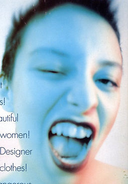
The main image is a close-up photo of Kelli Ali, the lead singer of the trip hop group Sneaker Pimps. She poses with a wink which is i-D magazine's trademark pose as mentioned before. What makes the photo an indicator that the magazine is a fashion/music/art magazine is that the model herself is a singer thus, music. Her hairstyle is also uncommon thus, the fashion. The style of photography does not prioritize crystal-clear pictures and the lighting is an unnatural colour and not a lot of magazines were doing that at the time so they are challenging the convention. Challenging the convention means experimentation thus, the word art. In my opinion, i-D did a really good job with the photo and making the typography around it colour-matching whilst still making everything stand out.
cover line

I'm not really sure if this part of the magazine is the cover lines or actually an extended tagline because this position would usually be for cover lines but at the same time the catchy marketing phrases leads me to believe that this is actually big tagline. However, I'm just going to elaborate on what are cover lines as I've already covered taglines.
Cover lines are basically teasers for the stories that are covered inside the magazine. Usually the magazine would just have the names of the articles put on the sides of the magazine. They serve to promote the content to further attract curiosity of the audience.
featured article
The indication that this is the featured article is the capital letters, the font being large and the word 'guide' which is to give advice.
barcode & price

The barcode is lines of varied width that store product information important for tracking inventory for the seller. The price is put there for the convenience of the buyer so that they don't have to go through the hassle of asking anyone for it.
date line & credits

The credits show who is responsible for the main image in the cover in this case they gave credits to the photographer and the model. The date line is to let people know when the magazine was issued.
contents page

title
main image
-
bold text : page number and articles
-
pink text : credits
-
normal text : extra descriptions
credits
For the contents page, I chose to research on the contents page of a different issue because I couldn't find any pictures in the internet. I have a few copies of i-D magazine at home which I scanned myself.
The contents page give a designated place for readers refer to the contents of the magazine just in case if they want to look for a specific article.
I like how they didn't do a big ''CONTENTS'' title but instead they put ''Insi-De THE WHITE TRASH ISSUE'' which ties into the name of the magazine [i-D]. Since they typed out the contents like a paragraph, they varied the text by giving it colour or making it bold [the bold text being the page number and article title, the pink text to be credits and the normal text to be extra descriptions]. I like how they did this instead of presenting the contents page in a systematic way with margins and bullet points like other magazine content pages. I don't really know why they choose to do this maybe it's just to save space. This just shows how different they are. What I also notice is that they didn't put the contents page as the first page but after a few pages with photos that fill up the whole page. So, it eliminates the need put a lot of photos to tease the readers in the contents page.
double-page spread

large image
headline
large image
captions
The double-page spread is when one article is using up two pages of the magazine. It is a page layout typically used for main articles in magazines. This double page spread is of the same issue as the cover I did research on and I managed to find an image of it. The thing I like about it is that the page on the left has a noticeable divide when it is extended to the page on the right as it gives a kind of buffer so that the caption's margin is a little bit further to the right and it makes the text more noticeable instead of putting the text margin on the left right after the magazine's spine. It eliminates the need for the reader to force the book open to read the caption. I also like how the colour of the text does not really contrast the background. The colour scheme still blends in and yet it still stays legible to the reader.
magazine research 2
For the second magazine, I wanted to conduct research on a drastically different type of magazine than i-D but more or less the same genre of magazine but the difference is the presentation. I wanted to look for a magazine that has a lot going on in it's graphical representation so I can combine the best of both worlds into my magazine. I had to go through stacks of my dad’s magazines that are lying around my house and one caught my eye which is JUXTAPOZ magazine. So, I chose to do research on that. Based on what I found in Wikipedia, JUXTAPOZ is a magazine that specializes in alternative, urban and underground contemporary art. It was established in 1994 by a group of artists and art collectors including Robert Williams, Fausto Vitello, C.R. Stecyk III, Greg Escalante, and Eric Swenson. JUXTAPOZ is published by High Speed Productions which is the same publisher that publishes Thrasher magazine in San Francisco, California.
They aim to bring contemporary alternative genres like psychedelic art, graffiti, illustration and such to be recognized at the same degree as other artforms in the mainstream such as old master paintings, pop art and such. They publish monthly and feature a variety of artists from the underground that deserves more recognition. Some big name artists that they have covered in their magazines are KAWS and Mark Ryden in the early 2000s.
Below are some of the covers that I like.


I notice their house style is not really consistent as they tend to follow the theme or motifs of the art that they feature and it determines how they present their works which is not really a problem. If people can read the title of the magazine, they'll recognize it. House style refers to a magazine's overall style in how they present their work which includes the layouts, photography techniques, subject matter, colour schemes, graphic design, typography and such. Comparing it to i-D magazine, they completely embody their house style in every page of their magazine and just present the subject that they feature like an art gallery whereas JUXTAPOZ doesn't. I'll elaborate further by analyzing the cover page, double-page spread and contents page of JUXTAPOZ volume 2 no.2 from spring of 1996.
cover page

bar code, date line & price
tagline
masthead
cover line
main image
featured article
Referring to the statement I made about the house style depends on the art that they feature, for the cover on top, they followed the colour scheme of the painting made by Kathy Staico Schorr. In the case of JUXTAPOZ, they are more focused in promoting the art itself so they rely on the art piece to become the cover. This is the main thing that I like about JUXTAPOZ. They embody the art that they feature to dictate their house style. The art piece can either take up the whole cover page with the magazine conventions in it or they'll either put borders and put the magazine convention outside of those borders to avoid crowding. A lot of covers have a lot going because of the complexity of the art that they feature but I notice that the magazine conventions like the masthead remains simple. A lot of the covers remind me of comic book covers.
The above image is the cover with the conventions labelled. Below is my research on the magazine's conventions and my elaboration some of their significance.
masthead, tagline & cover line

The masthead is the name or the logo of the magazine. Usually indicated as obvious capital letters that are bigger than the rest of the typography in the cover. For the magazine to achieve success, it has to have a name that is easy on the tongue to say and eyes to look at. In terms of the design for JUXTAPOZ's masthead, I don't really see anything special in the typography other than the cool name. However, they made a name for themselves because of the content that they put out throughout the years. I notice that in a lot of their covers, they use the colour that is least used in the art for the masthead. The colour that is least used gives the masthead prominence while staying in the colour scheme of the art. The simple font of the masthead doesn't take the spotlight away from the art. This combination gives it a good balance of making the masthead recogniseable while not being too extra. The example is in the cover above where the colour purple of the vein or artery of the heart is used for the colour of the masthead which ties them together quite nice.
The tagline for JUXTAPOZ is not used in a marketing/advertising perspective but more for as a slogan or phrase that tells a bit about what the magazine is about. I can't find information on what is art nadir and why they chose it as their tagline. I looked up the definition for the word nadir and it means opposite in arabic and the word juxtapose means to place different things together to compare or contrast them and the word art is because the magazine is an art magazine. It's quite clever and I like how the tagline and the masthead is tied in together.
Cover lines are teasers for the content that is covered inside the magazine. They serve to promote it to further attract curiosity of the audience. For this magazine, instead of putting a catchy article name, they put the artists' names that they feature on top of the cover page. Names are sometimes familiar to a certain amount of people. These are the people that the magazine wants to attract so they can further promote it by word of mouth to other people. By putting artists' names, people will get curious to read the magazine because they have heard about them or know about them.
main image

The main image is a painting by Kathy Staico Schorr. She was an illustrator in New York for 10 years before fully committing solely to painting. I read the article and she actually makes notes before painting her ideas which not a lot of people do or is just unheard of by me. She chooses the best of them and it will develop themselves on the canvas when she paints. Her work reminds me of the mexican art with the skeletons mixed with expressionism which gives off childlike charm accompanied with slightly unsettling undertones similar to Tim Burton movies because of the symbols of life and death. It is a brilliant style combination.
featured article

The featured article is on Kathy Staico Schorr on her background in art, what inspires her, descriptions of her work. Instead of putting the article name, they just put her name on the cover and the article name [Skeletons in the Closet] in the contents page for some reason. I notice that this article is not really ''featured'' because the article only took up 2 pages which is the average amount of pages taken up by each article so it's not really detailed and the magazine is not that focused on one artist. I think the way it works is that they just choose the best art for the cover which is quite interesting.
bar code, dateline & price
Barcodes are lines that are supposed to be read by a scanner to represent information about the product that can be stored and transferred easily for ease of inventory management.
The Dateline is to indicate when the magazine issue was published.
The price is put there for the convenience of the buyer so that they don't have to go through the hassle of asking anyone for it.

contents page

image
image
title
article & page number
The contents page gives a designated place to refer to the contents of the magazine and which page they are located at so it is easier for readers to look for a specific article. Compared to i-D, they are more conventional in terms of presenting the contents page in a formulaic manner with the margins, bullet points and all. Instead of putting only one image in the contents page, they chose to put a few of the artworks in the contents page and labelled them with the page numbers associated with the article and artist name so that the readers can pick the art work that interests them so that they can read about it which gives extra convenience to the reader and also fits as an art magazine.
double-page spread

large image
headline
blurb
captions
The double page is a page layout when the presentation of an article takes up two pages of a magazine. I pick a different article rather than the main one in this issue because this one caught my eye more and it is closer to the vision that I have in mind for my own magazine. This article documents two artists named William S Burroughs and Hunter S Thomson who makes paintings and sometimes shoots cans on paint that splatter on the canvas with live ammunition. The article mentions that they are also writers whose work explores and documents madness. What I like about this double page spread is how they layout the page and how they followed the style of the artist to determine how the page looks. They chose to put two pictures at the left page and the article captions on the right which gives it a different look and feel compared to if they did it the other way around which is a good thing. It makes the layout more interesting, The quotes and unevenness of the images add a really tasteful flair to the page because the art also looks rough and messy. My favourite part is the paint splatter behind the headline title to mimic the image on the bottom left as it adds so much character to the page and it is also accompanied by the text with different sizes in front of it. I also like how the paint splatter turns white when it is in contact with the typography of the headline title. It gives character to the headline itself. Unintentionally, it just looks like a mixed media art piece in itself even though it is not. Overall, I will be taking a lot of inspiration from this double page spread because of its complex, rough and intense style of presentation.
note: Some of the magazine pages I scanned using a flatbed scanner at home because I couldn't find a proper high quality photo to use from the internet. That's why some of the photos are not straight.
PRE-PRODUCTION PLANNING
Now, I think I have done sufficient research and gained enough inspiration and familiarity so I can actually start planning the production of my magazine. This will act as a digital notebook or diary for me to put in my ideas in an organized manner so that I can refer to my ideas and not lose track of my thoughts.
The contents of planning:
-
masthead
-
inspiration
-
props and equipment
-
photoshoot schedule
-
magazine layout.
masthead
For magazine names, I'm thinking of naming it c_mgirl magazine after the song by machine girl of the same name because for one, I couldn't think of any names and I was never good at naming anything. Another reason is because machine girl's music is a good representation of how the magazine would look like in audio form. The name also looks good when you just type it out because of the underscore which acts as kind of a censor because the word camgirl is a dirty word that would definitely attract attention just because it is edgy. A camgirl is a video performer who performs erotic acts in front of a webcam and livestreaming it to an online audience. I chose this as my masthead also because I want to tap into that kind of culture of how 'online' our generation is and how just from the change of how we receive and perceive information sparks vastly different sub-cultures and trends. This name is also not too long and no one has used it as a masthead before.
inspiration
Here, I will conduct research on poses, camera shots, angles, photography techniques, colours, design layouts and such on material that I have found online that inspires me and fits the image in my head. I will try to combine together in my magazine.
One of the main sources of inspiration is mixed media art mainly the type to have elements of digital graphic design [photoshoping and illustrator] mixed with scrapbooking techniques, collaging, chemicals, sculpting and such. Here are some examples:


These are all made by Anton Reva. He experiments with methods of processing and editing photos combining analogue and digital techniques embracing both worlds and taking collage art to a whole new atmosphere.
Another artist is Doron who mainly specializes in digital graphic designing but recently he also has been experimenting with mixed media methods in his designs. Here are some of them:


I'm not really sure how he made this but my guess is that he first designed the graphics and printed it out and rubbed alcohol on it to get that smudged look and rescanned it and did some digital touch-ups. The smudged gives it a very angelic look. Fun fact, Doron makes graphic design tutorials in youtube that are not the basic boring wedding photo edits but actually teaches you how to make designs similar as his. He is where I learned a lot of graphic design techniques when I started out.
My mission for my magazine is to take this style of presentation and make it into a magazine format and also develop it into my own style. This kind of presentation cannot be planned and can only be figured out as you are doing so I will elaborate more in Product Development.
Before editing, I must know what kind of photos to take and the poses for my models. I'm not really doing anything completely different from my last magazine photos-wise. I seek to develop and improve the idea further in this magazine. To recall, the photos should have a bloomy diffused look as crystal-clear high definition photos would not match with the art style I've mentioned. I want the photos to look very blissful and mystical to not resemble reality. I plan for the angles to be exaggerated with low closeup shots or birds eye view angle and maybe utilizing the straight-up shot often used by i-D magazine. I'll figure it out on the day of shooting itself. As for the poses, it should be elegant, dance/ballet-like and gender neutral. Here is a photo that I found online that matches my description. However, I don't know who took it nor the model's identity.


I also plan to use my old mini dv camera to record short interviews and some other footage with a fisheye lens and use shots from those as photos to make it look like interview clips put into the magazine.
magazine layout
Here, I will sketch how the general layout of the magazine will look like on blank paper along with its conventions but not down to the details because it's quite difficult to predict where I will position things without having the photos at hand. Furthermore, planning the magazine layout will not be as important as the photos as the art style that I've mentioned under 'Inspiration' is basically making use of mistakes so a lot of the things that go into the editing process will be spontaneous. So, the final product might be drastically different from what I have drawn and I will not spend too much time on sketching. I will put the actual magazine layout plans in Product Development once I have my photos.
photoshoot planning
I want to take photos of not just outfits but also their surroundings [could be their bedroom] because I want to capture how their personality manifests physically which affects their surroundings that they are regularly present in. Photos will have a similar symmetrical angle like a Staley Kubrick film but with different surroundings and the subjects just doing what they like in their space dressed how they want. For example, a musician would play an instrument, a gamer playing video games, a geek reading comics and things like that. I might also feature some of the fruits of their hobby like art pieces or drawings. All the photos will be shot in the style which I have mentioned under 'Inspiration'.
subject
I want the subject/model to have a colourful personality with a lot to say accompanied with unusual looks and style with a range of hobbies. One potential candidate is my friend Joshua Ting. I feel like he has a lot to say in general even on such mundane topics he can make them seem so complex. Is he pretentious? I don't know but the things he say make sense to me and I get it. He's got a range of hobbies such as producing music on his computer. He used to do programming, he likes to play video games and such. Since, late 2020 or early 2021, he has been on a journey of finding himself in terms of music and his identity. He dove deep into his fashion sense, his identity, where he was at, his music, his skills and such from meeting and hanging out with drastically different groups of people within that small time frame. I want to document some of what he has to say about all that.
He is 18 years old, 6 foot chinese boy with glasses and he can fit my clothes which benefits me as I can style him to adjust him to his truer image as some of the clothes I have he really wants to steal from me. He also plays a little bit of guitar, a little bit of piano and he is also in my band called Chlorine playing the keys. This was my previous magazine cover which he was also in.
Based on my ideas, the complete magazine would document all sorts of people who have no professional modelling experience, just people who I find interesting that represents the wide spectrum of people my age to completely get my point across but unfortunately I have no time for that at the moment. For now, I will only be documenting Joshua. Who knows, I might continue this in the future.

mise-en-scene
I will conduct a photoshoot in his room because his room is quite spacious, not cluttered, easy to manage and has great potential for different types of angles. Originally, I wanted to have a different subject and calibrated a fictional story with my room as the mise-en-scene because it is cluttered and filled with vinyl records, music stuff and looks 'cool' but that would ultimately be fake and I want the things to be said and documented to be real and grounded because I am that kind of person. Plus, it would make my job easier as Joshua would do most of the talking, Furthermore, I would also be taking pictures of places he regularly goes to such as studios where we do band practice and fool around people that he knows with candid shots. I will take photos of the mise-en-scne if I get there and I will put it in Product Development.
props
-
clothes
-
accessories
-
Joshua's computer
-
musical instruments
I will put in behind-the-scenes photos of the various outfits that he will be wearing on the day of shooting.
planned equipment [pictures in coursework development
-
my dad's Canon EOS 80 for clear hd pictures
-
my Sony vx1000 camcorder for interview clips
-
my Panasonic camcorder for interview clips
-
my phone for behind-the-scenes and candid pictures just in case the camera dies
-
ring light
-
tripod
-
fisheye lens
-
scanner for scanning printed pictures for mixed media stuff
-
projector and laptop just in case I wanna do some of the projcting images onto subject thing I did for my film opening project