FABYAN MEDIA STUDIES A LEVELS
2022/2023
PRODUCT DEVELOPMENT
shooting day
On this page, I will document my journey on how I develop my ideas into the final magazine. I will also further elaborate on my production choices, styles that I'm going for and more.
It seems as if time is actually against me. I don't know what I have done to deserve this. Shooting was not done until 9th January 2023, a month delay. Shooting was supposed to be done during mid-December during the holidays because the first two weeks was band practice and my band mate Haris organized a gig that he wanted to for a long while. I have school work from other subjects as well as hanging out with friends to stabilize my sanity. The delay to January was because Joshua and his family went overseas and toured the whole South-East Asia for the rest of the holidays so I pass the time and relieve myself from stress by playing Dark Souls and guitar.

On the day, I texted Joshua that I was coming to his house to shoot. He didn't reply even though it was well into the afternoon. Arrived at his house and his mum let me in and I went upstairs to his room and he was sound asleep. It turns out he was out at night until 4am with his friends.


Before we started shooting, I just waited for Joshua to take a shower and eat 'breakfast'.
My purpose of shooting the model in the bedroom was because I had to document their space of living and how their personality effects their surroundings and also how it affects them. Joshua has a minimalistic room and house so it was surprisingly photogenic and easy to work with. The shots that I had planned was of him and his dog, Happy Lim on the bed and Joshua playing the keys, outfit pictures, him using his computer, him in the bathtub as well as taking some videos of him fooling around and being himself. The rest is just spontaneous. I had incorporated various photography techniques and angles that I had documented in my research and planning tab such as long exposures, colour flash gels, fisheye lens and mini-dv cameras. The angles I had done were mostly medium shots, some closeup shots, wide shots, birds-eye view shots and more. The poses were all spontaneous and surprisingly not corny looking. It was all from the top of Joshua's head.
equipment

-
My dad’s Canon Eos M6
-
Vx1000 mini-dv camcorder
-
Tripod
-
Joshua’s led camera light

props

Joshua's synth was the only prop but there are also a few photos with a minecraft sword he put in between his armpits to simulate him being stabbed in the bathtub which looked pretty cool but I'm not sure I'm going to use it. However, I might because the game minecraft is a big part of his personality and his upbringing so he might say something about that in the double-page spread.

This is the photo.
clothes & accessories

The first outfit:
-
t-shirt from Uniqlo
-
grey shorts probably from Hua-ho, a local department store bought by his grandmother
The second outfit:
-
my cargo pants I bought from a thrift store
-
Carhartt berm jacket
-
button up shirt and tie.


The third outfit:
-
same cargo pants
-
Uniqlo fleece sweater from the women's section
-
Golf le fluer Converse sneakers
This shirt was designed by my good friend Fahmi and printed by my friend Afiq for his own clothing brand called UN-OFFICIAL.CO. I included this shirt to bring attention to my friends' talents.


These are the jewellery that he wore throughout the shoot.
-
The beaded jewellery was made by my friend Minori who is also a media student who made a documentary about the local music scene in Brunei.
-
The necklace is from a trinket shop owned by a thai woman
I chose these outfits because they are his outfits and for the clothes that are not, they are the clothes that he wants but just can't get and by wearing them, transforms himself to the ideal version of himself that he sees in his head.
mise-en-scene


Joshua's bedroom
Joshua's bathtub
backyard corridor
odd outdoor kitchen
garden


First, we shot the one on his bed playing his synth. I utilized the natural lighting in his room for that and moved some furniture out of the way. Then, he changed outfits and I wanted to take a top to bottom picture with the shoes but shoe aren’t allowed indoors so we headed outside to look for a concrete wall. We found a nice wall around the garden area that has a very nice weathered look and has a bit of moss on it which makes it standout from a lot of concrete wall photoshoots. However, there was one huge drawback and that being the wall is only chest height. So, I decided to take photo of him sitting down. We tried various poses of him sitting and I liked the one where he shows the sole of the shoe as there is a flower design on it. The shoe brand was Golf le fleur which is a brand started by his favourite artist Tyler the Creator.
We went further in the garden and there is a tight corridor which we came back to at night because I thought that corridor would look cool filmed at night with red-lighting with a fisheye lens as it would warp the walls.
Around the corner, was an outdoor sink for chopping vegetables which I think is quite odd and interesting. So, I decided to shoot more photos there. We shot here during the day and at night with different outfits. One of the outfits was a t-shirt designed by my friend Fahmi and printed by my other friend Afiq. State brand name* wanted to give attention to their efforts.
Back at Joshua’s house, I shot photos of him standing on different positions at the corridor and I want to edit those photos together so that it would look like there is multiple Joshuas in the corridor. One of the poses was him hanging off the balcony of the stairs which was improvised.


Came home with more than 170 photos this time which is quite a lot and I am quite happy with the results.
magazine genre [updated]
Disclaimer* fashion is not the main focus of the magazine so fabulous outfits should not be expected of my magazine because I couldn't find a model who could pull it off as well as lack of clothing that is like that. I just put together outfits that I could find that remotely has some of that substance but toned down. Now, I can finally conclude that my magazine is now a culture magazine which documents various people who aren't professional models in different pages of the magazine. Just various people found off the street with colourful personality and a good sense of personal style. Almost like i-D magazine but not for celebrities. However, the fabulous fashion could be a thing in my magazine just on another page. For now, I'll only be documenting Joshua.
editing [front cover] pt.i
I will primarily use photoshop as the editing software. I have not touched this program in a long time mainly because of school and I only spend my free time resting and partaking in activities where I get to turn my brain off.


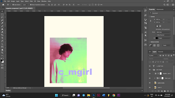
I chose these 4 photos to put in my front cover. I added these photos in gradually overtime to which I see fit. The one on the bottom right was a personal request of Joshua to put in the front cover.
1.

First, I the colour of the canvas to fffcec because it is my favourite kind of white and it's better than plain white. After that, I imported my photos, edited it using the camera raw filter to increase its exposure, temperature ad contrast to my liking. Next, I cropped it to what is seen in the screenshot. Then, I added the masthead in the middle. I had made no plans on the layout. For me, I make plans when I embark on the journey itself.
2.

Next, I experimented with the gradient maps and colours to see which fits. I ended up with this as a result of playing with the blending modes of each layer. At that time, I thought it was nice. It turns out it would be thorn in my side throughout the making of the front cover along with the masthead.
3.
At this stage, my vision was clearing up and I started to make plans for the layout. So, I repositioned things like I put together a collage and at the same time, formatting it like a paint catalogue because paint catalogues intrigue me. I also want to put some kind of piano graphic on the top to fill the space.
4.

I used this picture of Joshua's synth. Adjusted the exposure using the camera raw filter. Then, I cut it out using the normal lasso tool instead of the marquee tool as shown above because I wanted to figure out a way to blend the image into the cover without having a point where the image is just cropped.
5.

I found an interesting effect when I changed the blending mode of the synth to exclusion. It just turns into the synth's silhouette and it has a slight grainy effect like it was stamped onto paper and has a beautiful blue colour. Unfortunately, as I saved the project as a jpeg, the result isn't as it seemed because the grain is too fine to be displayed by my monitor to show how it truly looks like.
6.

As you can see, you can see where the grain ends and it outlines how I carelessly cut the picture out using the lasso tool. It doesn't blend how I want it to and I don't like that!

7.
Solving this problem was a matter of trial and error. I added a little more grain and I added a threshold and a posterize layer to it. I adjusted it so that the grain is more focused to the more darker areas. After that, I merged the layers and changed the colour back to the blue and also used the eraser tool to clean up grain that I don't want.
8.

As for the barcode, I re-used the one I made for my previous magazine project and just changed the dates. I also removed the white background using the magic wand tool.
9.

After all that, I added dummy text to where I want it to be to plan out the layout. I also have not came up with what the names of the articles are. Above is how the general layout will look like with some variations made along the way. I slightly offset all the assets to the right because I like asymmetry. It adds some sort of personalization to the cover and that it doesn't look like it follows a format.
masthead [updated]
I was laughing in frustration when me and my friend Yousseff made a joke that the underscore is like blank to be filled with a different letter than ''a''. So, I decided to change it. I went on a call with Joshua we came up with a few names but we landed on Lemonhead?! magazine. Before, it was Oxygen magazine but it was too generic. Since, the magazine is a people/culture/life magazine, the meaning for the name was a question which was what do you need for life? Oxygen! For Lemonhead, it was what does life give you? Lemons. It's a play on the popular statement. The ''head'' was added to the lemon because lemonheads are what the magazine refers to the people featured in the magazine. I added ''?!'' to the Lemonhead for style to make the typography look better.
editing [front cover] pt.ii
10.

I experimented with fonts with the masthead to see what looks good. I actually like how my previous masthead looks in terms of typography but it only has one fatal flaw which eliminates its use.
11.

It turns out none of the fonts look good on this masthead. It always looks too bulky and long and just looks like any other text and not like a logo. I had to figure out a way to make it compact. So, relied on scribbling because I have no time. I used the brush tool to make masthead.
12.

For the credits, I used thicker font for the names of the people and light fonts for the others for contrast. I also chose this bright blue colour because it looks elegant and futuristic. It stands out while still fitting with the rest of the colours.
13.

I added a thumbnail photo and adjusted the contrast to full using the camera raw filter because it looks nice and the textures pop out more from each other.
14.

For this photo, I only adjusted the tint to make it more green to fit along with the rest of the photos.
15.

After that, I added a grain layer to those photos to make it the same texture as the big one on the left because if I leave it as it is, it wouldn't look right. For the green one on the bottom right, I blended a wavy line art graphic on it for more texture and variety. For the grain layer, I cut out a section of it using marquee tool and enlarged it so that the grain wouldn't be too fine. Then, I blended it to vivid light on the picture on the top right and created a clipping mask.
16.

I added the main article to just the artist name because all the title I came up with are very corny. I coloured it red so it can be identified easily. I also enlarged the title to distinguish it from its short description below. I also changed the colour of the masthead to yellow and added a stroke. Now, it actually looks like a lemon. I also added a tagline but below the thumbnail picture because I can't find a proper place to put it next to the masthead. Its placement is ugly and it doesn't make sense so I removed it later on. For the green picture, it looks more darker because I thresholded it to select all of its white values so I can delete it to make the picture more clearer and less hazy but still remaining hazy.
17.

Before I changed the colour of the masthead to yellow, I erased some of the parts that join together and drew them differently to make the wording more legible and recognizable.
18.

This is what it looks like after all the arrangements. You cannot tell from this picture but I further added textures from blending scan lines from printers to give it a slight photocopy look and that this magazine was handmade.
19.

I wasn't satisfied with the colours because I don't like the bright green. What I did was changed the added a blue colour overlay on the photo above. The blue is the one I used for the keyboard graphic. Below the layer of the photo with the colour overlay is the raw photo. I changed the blending mode of the photo with the colour overlay to linear dodge (add). The brightness layer I changed the blending mode to lighter colour and also the gradient map layer, I changed the blending mode to saturation.
20.

After that, I repositioned all 3 photos lower, the green one I enlarged it abit, the masthead above and I also removed the tagline because it doesn't fit well if it were placed on the bottommost right. It makes it feel incomplete.
21.

Some little details I almost forgot to mention is that everything except for the barcode is displaced using a photocopy displacement map to give it a slight ink bleed effect to make it look printed by hand. Also I added pink stains using the brush tool. I added a rectangle layer behind 2 photos and also tilted it ever so slightly and also displaced it to make it look it the photos were cut out. All these imperfections are made to make it look homemade. However, for the layout, I tried my hardest to make it look as elegant as possible in ways that I only know with the limited time that I have. I also made everything a little more centred because it turns out the asymmetry doesn't look nice with the background this website has.
This is the final product at the moment. For now, I don't see anyway I can improve this cover. The quality when saving is set to high instead of maximum because wix doesn't allow files that are too large.
editing [contents page]
For the contents page, I will be editing using photoshop and inDesign. The last time I used this program was from making the double page spread of my previous magazine project which took place somewhere in April last year.
1.

Way before I started making the contents page, I tried to make a main article logo which I decided to put in the contents page instead. I wanted to make like a TV screen displaying the artist name as a logo from a viewfinder screen of a broken camcorder I took apart. I scanned it on a flatbed scanner.

2.
For the typography, I wanted to draw it out on paper and pour alcohol over it to get an exaggerated ink bleed effect. I talked about the ink bleed effect in my research & planning page. As you can see, I'm not much of a pen and paper kind of person. I lost all my talent during my pre-pubescent years where I wasn't interested in anything.

3.
This one was the least terrible looking which I chose. I did the ink bleed effect using rubbing alcohol and a cotton bud to get a little more control on the ink bleed so the typography is still legible.
4.

I cropped the image to make it smaller using the marquee tool and proceeded to experiment with gradient maps to find a good colour. I did this in photoshop of course.
5.

For the screen, I wanted to find a way to make the quality of the picture not look realistic yet still detailed. I added gradient maps to it, grain effect and other things but in the end it's just a posterize layer that I added which gave an effect that I like.
6.

I abandoned the gradient map method for the typography and instead used a red colour overlay which gave the typography subtle colour compared to using gradient maps. I cut out the black screen using the magnet lasso tool and only leave the frame of of the screen and arranged the typography in the centre of it. Originally, I wanted to leave the black screen in and blended the screen to the typography. However, I would have to sacrifice the colours of the typography.
7.

8.
This is how the logo looks like which I quite like.

In indesign, I first added the 'contents' header on top and changed its font to acumin variable concept extra condensed light. Then, I added placeholder text in the place of the articles to plan how I should format this page. The picture above shows how the text looks like with the actual articles. The dummy articles are accompanied with short descriptions to make the page more filled. The descriptions are from real stories told by people that I've met condensed into funny sounding sentences. As of now, I am going back and forth working on 2 laptops because indesign stopped working on my laptop and I have to work on a schedule because the owners of the laptops want to use it as well so there is another obstacle to face.
9.

On the lower section of the page, I added the logo for the featured article I made in photoshop using the rectangular frame tool. Then, I added the credits below the image. I followed the motif of the typography on the upper corners of my cover that says the issue name and date [the font, the colour and the size].
10.

I added the page numbers to the articles. This is the current page layout I'm following for now. I'm planning to change it up because it looks boring.
11.

I tried to add the logo to the contents page but I couldn't make it work. I also added strokes to the articles to make them distinct from their descriptions.
12.

I added colour to the articles instead of the credits because I felt like it draws the attention away from the articles if colour is added elsewhere. The vertical text on the left was me trying to find a new layout for the contents because the layout looks like the contents page of my previous magazine project.
13.

I decided to change the font of the articles instead because it looks too formal compared to the typography seen in the cover.
14.

I thicken the font of the 'contents' header because it looks too boring and I was trying to find a way to make it look more nicer, stand out more and make it look more different from my previous contents page. I also added the issue name on top of the contents page to fill the empty space and it also makes sense to put it there because it lets the readers know what issue they are reading.
15.

I changed the font back to black because the blue looks too distracting. I also changed the articles to lean to the right which gave an unusual yet nice disposition to the contents. Furthermore, I gave up on trying to find a drastic way to switch up the layout because I am limited by time and I also didn't want to give too much time and energy into the contents page.
16.
A week before submission, after all the other setbacks, comes another one. My files were corrupted and I had no way of recovering them. So, I just had to recreate everything from scratch and using past screenshots as references. It turns out doing that wasn't all that difficult. It also didn't take too long. From that, I have realized that most of the time consumed when I sit down in front of my laptop is me thinking to come up with ideas instead of doing the work.
17.

I then saved the project from indesign as a jpeg o I can put it to photoshop so I can use it as a guide to make the contents header.
18.

I use photoshop on my laptop because it has more fonts downloaded. I used a japanese font that can also work on english alphabets called CP font and I stretched it. I added 2 stroke layers in the effects panel with one of them that has a thickness of 20 pixels with its opacity turned all the way down and a black stroke that has double the thickness of the first stroke layer. This gives the typography a spaced outline.
19.

I used the ellipse tool to make bullet points for the page numbers to be inside of.
20.

After I positioned the circles I merged them into one layer called 'balls'. After that, I typed the numbers on a new layer called 'numbers'. In the 'numbers' layer, I selected the numbers with the magic wand tool. I clicked the 'balls' layer while selected. By doing this, the shape of the selection is still maintained as the numbers and now I can click backspace to get rid of the space in that selection.
21.

22.
I then got rid of the 'numbers' layer and this is what it looks like.

After that, I messed around with various images and played with the blending modes for textures. I found line art and put it over the contents page and changed the blending mode to difference. It gave it a retro futuristic look that I really like but unfortunately the picture is low quality so I had to try something else to make it work.
23.

I added a noise effect to the image, thresholded it to make the details more finer and made a gradient map following the colour scheme of the image in no. 22. After a while, I chose to make the line art thing more subtle. So, I selected the darker colour values using the magic wand, duplicated it and deleted the original layer so that it would only show the lines without the background colour.
23.

I added a light blue colour overlay to the line thing and also erased some areas to clean up the area to not make the page look too crowded. I like how the line gives a 3-d feel with a surface for the logo to sit on.
24.

I displaced everything to give an ink bleed effect and blended photocopy texture on top of everything to give a weathered colour to everything.
25.

I erased the dots using the eraser tool to remove the crowding. Then, I selected the middle blue ball. Duplicated it into a new layer and erased the original one to reposition it to make everything look equally distanced.
26.

This is the final product for now. It might change after discussing with my tutor or because I end up hating it. I forgot to explain some of the name choices for the dummy articles. The goateyes and the snailgod one just means what it means. Goateyes is a one-man band I performed in the same venue with and Snailgod is Joshua's childhood friend and he tells stories about some of the jobs he was hired for by the royal family.
editing [double-page spread]
Now for the double page spread. Exactly one week left before submission. I'm also going to be using indesign for text as well as photoshop for extra touch-ups.
1.

I started by typing out the main headline and made it big because I'm planning to use the logo I made for the contents page and mess with the blending mode for texture. If I can't make that work, I'll use this. For now, I'm just figuring out the format. I also added placeholder text.
2.

I plan to use this as one of the photos. In photoshop, I adjusted the contrast in the camera raw filter and temperature. I wanted the details in the photo to be more clear especially Joshua's table.
3.

I duplicated the photos and added a blue colour overlay on the top photo and changed its blending mode to give the photo some blue tones. Then, I merged those layers and I duplicated the merged layer and used the marquee tool to cut and duplicated 2 sections of the image to separate Joshua and Happy like a cut-out collage.
4.

I deleted the bottom layer and this is what it looks like.
5.

At that point, I wasn't sure on how to implement this properly to my double page because I didn't like how it looked. However, I kept the photo just in case I find a way.
6.

Back in photoshop again, I use a frame from the video I took with my camcorder that has my hand in frame under red light with Joshua on the wrong side of the railings. At first, I chose this picture purely because I like how it looks and how absurd it is. However, my tutor said I can't just add anything with that reason. So, I had to look for a meaning in it and I did stumble upon one. The article is about a young producer in a struggling music scene. In my notes, I mentioned about many locals have the fear of being the odd one out. Joshua in that picture is doing something absurd thus standing out, my hand in the frame coloured red, represents criticism.
7.

The photo's quality was terrible very pixelated at first and not the good kind. So, I just added a lot of grain to the photo to disguise it. I also increased the contrast to make the subjects in the photo stand out and it also gave it a more otherworldly look.

8.
I duplicated the photo and changed its blending mode to difference to take it a step further but it's unlikely that I'll be using this.
9.

In Indesign, I chose to use the photo as the background and also changed the colour of the background to black to blend with the cropping of the image. I also changed the text to white so it can be seen better.
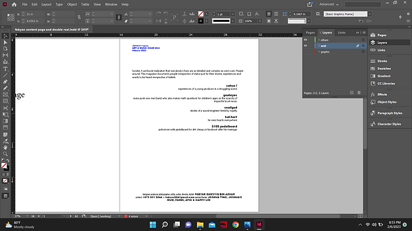
10.

I typed an intro to the article. Gave some background information about the country and how the scene is struggling. I also wrote some of my theories to why the art scene is the way it is. I also gave some background information on Joshua.
11.
I conducted an online interview instead of filming it because I thought it would give him time to think about his answers and also because I didn't prepare any questions on shooting day at his house.

12.

I went ahead and copied it down just in case there were some spelling errors and I also like typing despite not being slow at it.
13.
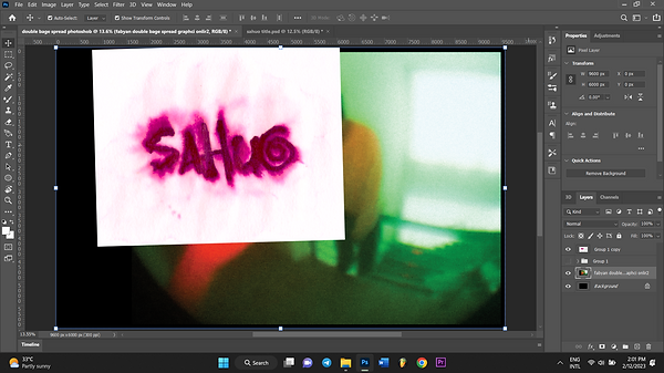
Back in photoshop, I took the logo I used for the contents without the frame so it can follow a different colour scheme for this page.
14.

I blended it to divide and it gave this glowing green colour which matches the page perfectly.
15.

I added the photo of one of the shirts that he wore during the shoot to fill in the empty space. I plan to put some typography below it that states the brand. I posterized, thresholded it and gave it a gradient colour that matches with the rest of the page. I couldn't think of anything else to do with it.
16.

I also planned to make use of the text wrap feature in indesign but I couldn't do it without detectable edges so I used the lasso tool to select the rough shapes of the subject that I want them to wrap around in photoshop.
17.

I imported the new version of the graphic [the one with the new sahuo headline] along with the cut-up shapes for the text wrap [in a new layer]. Then, I did the text wrap. This took me a lot of tries to get it right. At first, I did the text wrap around Joshua [in the photo] as well but that looked too busy. The rest of the tries was me going back and forth photoshop to correct the shape of the hand.
18.

I went back in photoshop darken the background of some of the texts as they were illegible because they were coloured white. So I selected the white values using the wand tool, duplicated the selected area and added a colour overlay, used the eyedropper tool and selected the lightest colour that makes sense with the photo while making the text legible. I chose not to add a black box or change the colour of the font because it gets rid of the consistency of the style. My tutor said the text also has to make space for the middle because it's a magazine and the middle of the pages sink because of the spine. So, in Indesign, I made the main photo go in the middle and also split the text to make space in the middle. Unfortunately, I also had to get rid of some paragraphs to make everything fit in the page. Realistically, there would be more pages to this article.
Below is the full article: *disclaimer, this article is based on personal experiences, observation and theories. There are other people better at writing about this topic about me. I might be wrong so forgive me.
Brunei Darussalam is a country known for its strict laws in religion and freedom of speech. Because of that, various mediums of art have had a difficult time to flourish in this kind of atmosphere. However, it is not just because of that.
Generational trauma is prevalent in its general populous which is the Malays. A lot of them were brought up in conservative households which explains a lot of them to have a degree of shyness and ignorance unlike any typical nation. Negative experiences from childhood have diminished their initiative to stand out. It’s noticed that scolding tactics in school and at home follow a similar formula, offers that give a sense of free-will at the expense of standing out delivered with an angry tone clearly with the purpose of discouraging to take that offer. There are many examples of this but it can be understood only if experienced.
Cultural cringe also plays a role in the art scene’s struggle. Cultural cringe is defined by internalized feelings of one’s culture being inferior compared to others. In this context, locals believe that local music is cringe and this will eliminate curiosity to actually give it a chance. Everyone’s eyes and ears are pointed towards the west and they tend to forget that there’s a local scene too.
One stand-out producer is Joshua Ting Ren Xuen also known as sahuo. He is a young independent producer who is also a keyboardist in an alternative indie band called Chlorine. In his early days of producing, he produces his own brand of hip-hop music that blends off-beat swinging percussion with lofi jazz chords. Nowadays, he expands his sound to various sub-genres of underground hip-hop. Notable artists he draws inspiration from this category is jaydes which he has gotten the chance to work with, cartier god, bladee etc. He also makes house, drum and bass, jazz, bedroom pop and more. We at Lemonhead?! magazine has piqued an interest on his experiences in a struggling scene like this.
How did you start of producing?
‘‘I was 12 when my friend Gary [snailgod] showed me Logic Pro X when I went over to his house and thought it was pretty fun messing around making beats. I went back home and installed FL Studio. I was more into coding at the time and never really had an interest for music then, it was just fun to make.’’
Has producing music been fruitful?
‘‘Not really.’’ Even if your music is awe-inspiring piece that the world has ever heard, it won’t go anywhere without good marketing. Finding your sound is already hard enough but you also have to push it out to niche audiences to really build a solid core following. If I had known that earlier, I might’ve been a bit more successful.’’
What do you notice about other artists in this struggling scene?
‘‘I see a lot of talent being limited by restrictions of this country. Having live events are already a very rare occurrence here, being paid as well is even rarer and it shouldn’t have to be that way. There’s probably a lot of great local artists that we will never hear because they were never given the platform.’’
Is it possible to ‘make-it’ locally?
‘‘I think local artists have a better chance of ‘making-it’ if they cater towards the internet and its culture. Trying to cater towards locals is difficult because in such a small country, it’s hard to be experimental and publicize your music without being perceived as weird or not normal even if you think it’s good. It’s easier finding like-minded people online and to start building a community or finding one and sharing it there.’’
Do you think your upbringing is responsible for you passion?
‘‘Surprisingly, my upbringing has nothing to do with music. It was just by chance I happened to find out how to make music and fell in love with the art by myself. I used to listen to k-pop, pop and old chinese songs from my parents but was never into it. Although, I did notice that most of my old and passions were tied to creation. I used to be super into coding, programming games, 3-D modelling and robotics before music. My family is pretty much neutral about me making music. As long as I make money from it.''
19.

I also added blurbs on the side to fill in the negative space. I went back in photoshop darken the background of some of the texts as they were illegible because they were coloured white. So I selected the white values using the wand tool, duplicated the selected area and added a colour overlay, used the eyedropper tool and selected the lightest colour that makes sense with the photo while making the text legible.
20.

I removed the graphic on the top left because it looked too out of place and it takes away the consistency of the style that I'm ging for.
21.

In photoshop, I edited a photocopy texture, adjusted its grain and sharpness to give it more detail.
22.

Finally, I duplicated the photocopy texture layer and inverted it, set its blending mode to darken and the original one to lighten to give everything a weathered colour and also displaced everything to simulate ink bleed.
23.

This is the final product for now.
AMENDMENTS
I will make some amendments to my work either as a result from my own hatred of my work or after discussing with my tutor.
front cover
My tutor told me to add a white background behind the barcode because the background behind it has too many colours and might not be able to be detected by scanners. He also told me to move the masthead elsewhere and make it bigger because it has to be obvious that it's the masthead.

I changed the bright blue colour of the text to match the rest of the blue colours. It turns out I grew to hate it. I also forgot to turn on the texture layer when I saved it so this is the one with the photocopy textures. I made the masthead bigger so it's more obvious that it's the masthead and it looks better as well.
contents page
For the contents page, I have no objections nor my tutor does. Though I don't fully like it, I don't see any way I can improve it.
double-page spread
For the double-page spread, I amended further because I grew to hate the way the text is wrapped because I saw one of my screenshots for my coursework development that the tighter wrap looked better.
So, in photoshop I made the selection more tighter so that the text wrap is wrapped more closely to the object. I also edited the text and reduced the number of columns to only three. I did this to make the text fill up the pages better.
